

After the 4th best streak where the percentage of S&P 500 stocks closing above their 200-day moving averages remained greater than 75%, the recent correction across many of the major stock indices has put an end to this extremely bullish momentum.
This should not be viewed as doom and gloom, however, as similar occurrences throughout history have been followed by favorable forward returns several months down the road.
In the short-to-near-term, however, the trick for traders is going to be figuring out how to position themselves during this uncertain period where the market is still trying to find direction.

When the equity market is witnessing increased volatility and uncertainty as it has been in recent days, it is essential for bullish traders to find the sectors that are actually performing better than a benchmark such as the S&P 500.
Today, I’m going to show you how you can see how all 11 S&P 500 sectors are performing vs. the benchmark using just one chart, then we’ll look for some trading ideas in the one sector that is currently showing the best performance, by far.
2021 has been the year of “buy the dip”
2021 has seen the S&P 500 laugh at its sceptics, as the index has shrugged off every instance of negative momentum, breadth, and sentiment divergence.
While the S&P 500 is still only down 2.0% from its September high, the recent pullback marks the 1st time in 10 months that fewer than 3 out of every 4 stocks in this benchmark index closed above their 200-day moving averages (see Figure 1 below).
Figure 1
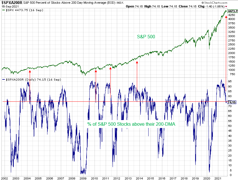
More often than not, when similar breakdowns in momentum have occurred it has been followed by the S&P 500 rallying to new highs somewhere over the months ahead.
The problem, however, is that there can often be a meaningful drawdown period (i.e., a correction) that transpires before the rally resumes.
Right now, we’re still trying to figure out if a bigger dip is coming.
Despite the uncertainty that currently exists, we do not have to fly blind.
We can look to see where the money is rotating behind the scenes, and to do that we can use something called a Relative Rotation Graph.
Here’s how to spot sectors that are starting to build relative strength
Relative Rotation Graphs are readily available on a number of charting platforms these days. Today, we’ll be using the version provided on the Stockcharts.com website.
Stockcharts.com describes RRG charts as follows: RRG® charts show you the relative strength and momentum for a group of stocks. Stocks with strong relative strength and momentum appear in the green Leading quadrant. As relative momentum fades, they typically move into the yellow weakening quadrant. If relative strength then fades, they move into the red lagging quadrant. Finally, when momentum starts to pick up again, they shift into the blue improving quadrant.
The clockwise rotation that occurs on these charts is very effective when prospective buyers of stock are trying to find the early stages of a leadership cycle, or when prospective sellers are trying to identify early signs of deterioration.
In both cases, the comparisons are made relative to some benchmark, which in many cases is the S&P 500.
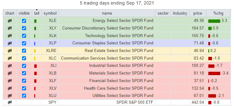
For today’s example, Figure 2 shows all 11 S&P 500 sector ETFs relative to the S&P 500 ETF (SPY).
Figure 2
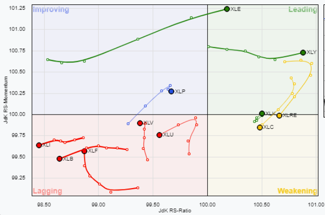
Figure 3
Though not visible on Figure 2 above, the S&P 500 ETF (SPY) is positioned at the origin (i.e., where the X and Y axis meet).
The long tails left behind by each sector are meant to help the viewer track each sector’s relative path over the past 5 days of trading.
The message that was being signaled by this graph at the end of this week’s trading is that the energy sector has been showing the best improvement of late and is just starting to outperform the benchmark, which allows us to speculate that there is room for continued leadership.
Here are two energy stocks I’m watching for the week ahead
As I scan the energy sector for favorable chart setups, I am focusing on names that have good bullish trend strength by trading above intermediate and long-term moving averages, are building a bullish momentum configuration, have a relatively high short interest, and have very well-defined protection nearby that I can use to define my downside risk.
First, there’s Callon Petroleum Company (CPE).
Callon Petroleum Company has been engaged in the exploration, development, acquisition and production of oil and gas properties since 1950.
As Figure 4 shows, I am watching CPE because it established a new uptrend this past week after rotating back above and using its widely followed 200-DMA as support earlier this month.
Figure 4
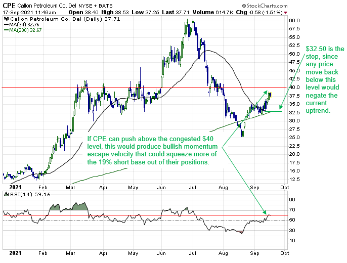
I also like this setup because I can use the $32.50 area as a stop, because any price movement back below there would be a firm indication that the current uptrend has broken down.
Finally, according to Finviz, 19% of CPE’s float is being shorted.
Given this potential squeeze-related fuel, I think a large rally can occur if CPE can close above $40, as this would help force shorts to reverse their positions.
In addition, such a move would push the RSI momentum indicator above 60, which, according to the textbooks, is a development that would release bullish escape velocity.
Next, there’s Ring Energy, Inc. (REI).
Ring Energy, Inc. is engaged in the exploration and development of oil and gas. The company operates primarily in Texas and Kansas. Ring Energy, Inc. is based in TULSA, United States.
As Figure 5 shows, I am watching REI because it pushed back above the congested $2.4 area this past week, and is now using both it and the 34-day moving average as support.
Figure 5
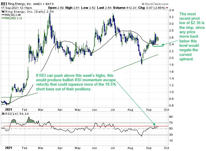
I also like this setup because I can use the $2.40 area as a stop, because any price movement back below there would be a firm indication that the current uptrend has broken down.
Finally, according to Finviz, 18.4% of REI’s float is being shorted.
Given this potential squeeze-related fuel, I think a rally back to the 2021 highs of $3.36 can develop if REI can rally above this week’s highs next week, as this would push the RSI momentum indicator above 60, which would help release bullish escape velocity.


2 Comments
Thanks Jeff – always interested in how to best follow cycles
Thanks, Jeff! KD