Hello Trader,
I need you to know something…
You are not alone!

No, I’m not talking about the fact that you can communicate with me through the Comment section at the bottom of every Ragingbull article.
That’s just a given!
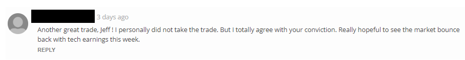
While I’m on the subject, here’s just a little sample of what folks are saying:

What I am referring to is the fact that market charts are always available to help guide you when trading conditions get tough.
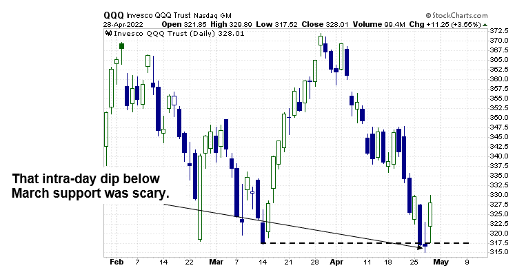
Perhaps there is no more perfect example than what occurred in QQQ this past week.
When we look at a price chart, what we’re looking at is a snapshot of the collective psychology of an enormous number of investors and traders.
That mass psychology forms patterns, not just on a multi-day and multi-week basis, but also on a daily basis.
Those daily patterns can often come in the form of Japanese candlestick formations that signal when an important psychological change may be taking place.
The example I want to show you today actually came from the QQQ this past week, where a formation known as a “long-legged doji” occurred.
While this in itself is going to be fun for me to educate you on, the support level on which it formed is going to make this lesson 10X as exciting!
Why?
Because the confluence of chart developments that occurred during this past week’s lows may be signaling that a bottom is developing.
Ready! Ok, let’s bring it home.
I am the first to admit that free-falling market sell-offs that breach price support, like what occurred in QQQ earlier this past week, are scary.
Under these circumstances, I’m usually wishing that I could just curl up into a little ball and sit back and watch things play out.
But I am a trader, and volatility brings opportunity!
So where’s the candlestick pattern I am referring to?
As this next chart shows, it actually formed on Wednesday.
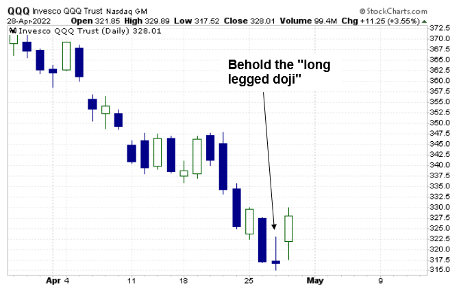
Now, in real time, it is very hard to determine that the trading day is going to end with such a pattern.
But when the trading day is over, and we see the open and low prices are very close together, inside wide-ranging highs and lows for the day, AFTER A PROLONGED DOWNTREND, the formation’s value is amplified.
Why?
Because it often indicates that an important stalemate between bulls and bears has finally occurred.
Like all chart patterns, however, there is no guarantee that it is going to produce the desired result, which in this case is an upside reversal from the lows.
BUT, when we combine this formation with the next charting tool I am going to show you, the odds of seeing the desired upside reversal increase.
So where did support come from if not from the March price lows?
It came from the Anchored VWAP originating near the COVID panic lows of 2020.
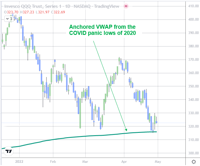
Therefore, I was in there battling for position during this week’s 1st half sell-off, and I am still holding positions.
Remember, while non-members are able to ask general questions via the Comments section of this article, members are actually able to ask about how I’m planning on managing my open positions.
To YOUR SUCCESS!