
In my 20+ years as a trader and market educator, I have never seen anything like AMTD & HKD.
One thing’s for certain, though, and that is that one of my TOP trading tools both captured the lift-off and signalled the collapse that shares in these subsidiaries witnessed this past week.

Let’s dive in!
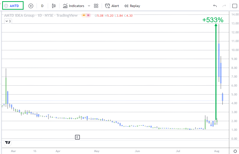
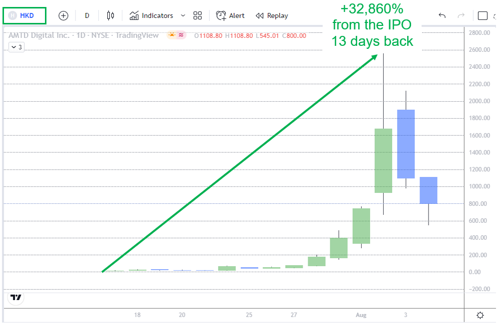
This past Tuesday, Hong Kong-based investment holding company AMTD IDEA Group (AMTD) surged as high as 533%, as its subsidiary AMTD Digital Inc. (HKD), a Hong-Kong-based digital solutions applications developer, exploded to as much as 32,860% above its $7.80 initial public offering price, just the 13 trading days after it went public.
Friends, moves like this are incredibly rare, so DO NOT let me find out that you’ve been beating yourself up for missing it!
And like I said at the open, not even I have seen such a move throughout my long career.
But what you should be concerned about is the fact that you still have not taken the steps necessary to learn about a tool that can help you both identify when such a move might be setting up and when it’s time to sell.
Here’s what I mean…
As traders, our #1 job is to exploit price trends and inefficiencies (when price is over or underpriced).
And my tool does both.
Show me, you say?
OK…as these next 2 charts reveal it did a particularly good job of both when looking back at what has transpired in AMTD.
First, let’s start with the lead-up to this week’s surge.
Note: this first chart does not show this week’s surge. The date range of this first chart is 07/1 – 08/01.
The first chart shows how the middle average (the 20-day exponential moving average) of my Keltner Channel setup first acted as resistance then became support for the launch phase of this past week’s skyrocketing price move.
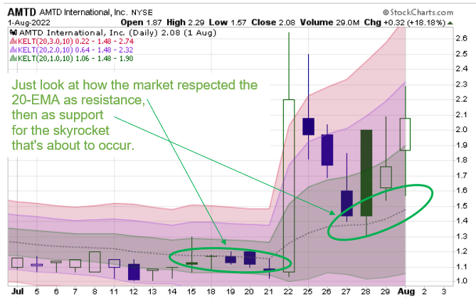
Friends, this is called “polarity,” when old resistance becomes new support (or old support becomes new resistance).
Now, this second chart shows the actual launch off of that middle moving average.
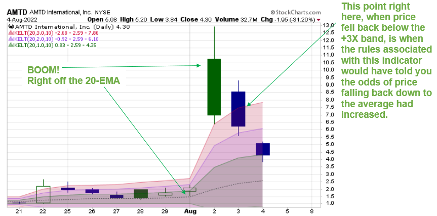
Not only that, but it reveals the power of this statistical study when it comes to figuring out when a stock’s price has become statistically vulnerable to mean reversion (i.e., moving back to the average).
I have my Keltner Channel study set at 1X, 2X, and 3X ATR above and below the middle 20-day exponential moving average (20-EMA).
These volatility bands tell me when price has either gotten a little too far (1X), very far (2X), or extremely far (3X) away from the average.
Now, I am not going to sit here and tell you that I would have been able to sell at the exact top of this rally this past Tuesday. Trust me, in real-time that’s very difficult to do.
What I can tell you, though, is that by following one of the key rules associated with this technical indicator, you would have been able to identify when the odds of the rally being over and price becoming vulnerable to falling back down to the 20-EMA had increased significantly.
Specifically, as the chart above shows, it’s when price fell back below the +3X Keltner band.
Friends, MEME stocks are JUMPING again, and I am using this same indicator to help me get in ahead of the next big move.
Who knows how much further this bear market rally can go?
Don’t miss your chance to join along with my Total Alpha members as I help them find the next movers!