
As if traders didn’t have enough to think about already, did you know that there are two different styles of charting calculations you need to consider before analyzing short- and long-term charts?
That’s right!
When looking at charts from a short-term perspective, you’re probably using a linear chart, which is the default setting on most charting platforms.
Since linear charts are best suited for displaying short-term data, this is the reason why most platforms start you off with them.
When zooming out, though, to gather as much information above where a stock has been over the long term, you should consider switching to something called a logarithmic chart.
Trust me when I tell you that the difference between the two is often night and day.
I’m about to show you how these charts are calculated, the different stories they tell, and how to adjust your charts to reflect these calculation changes.
Linear vs. Log (Logarithmic) Charts
I know that life is busy and that you’re constantly finding yourself having to absorb seemingly endless amounts of information.
But as most experienced traders will tell you, to grow as a trader you must take the time to fully understand all of the different aspects of your chosen trading style.
Before a trader can even begin to dissect a stock chart, he or she needs to understand the difference between linear and a logarithmic scale.
Linear Charts Explained
On a linear scale, all whole numbers are equidistant from each other.
For example, the distance between $1 and $2 is the same as the distance between $56 and $57.
This can create problems for securities that have seen huge price moves.
Essentially, linear charts INDICATE? underrepresented price changes made when the security price is low (relative to the rest of the prices on the chart) and over-representing price changes when the security price is relatively high.
Logarithmic Charts Explained
A logarithmic chart is scaled quite differently.
In this case, the numbers are not equally spaced distance-wise.
Instead, they are equally spaced in terms of percentages.
For example, the distance between 10 and 20 is the same as the distance between 20 and 40.
What this means on a stock chart is that a price bar representing a 50% gain will be the same size no matter where it appears.
These charts help put large dollar moves in context and are particularly useful when stocks that have grown exponentially.
An easy rule of thumb is to use a log chart once a security has doubled on the chart.
Linear charts can often mislead on exponentially growing securities.
Whoever came up with the expression “a picture is worth a thousand words” was probably referring to this subject.
So, let’s look at an example.
On Figure 1 below, we see two charts.
The top chart is a linear chart of Novavax, Inc. (NVAX), while the bottom chart shows a logarithmic chart of the same stock over the same timeframe.
Figure 1
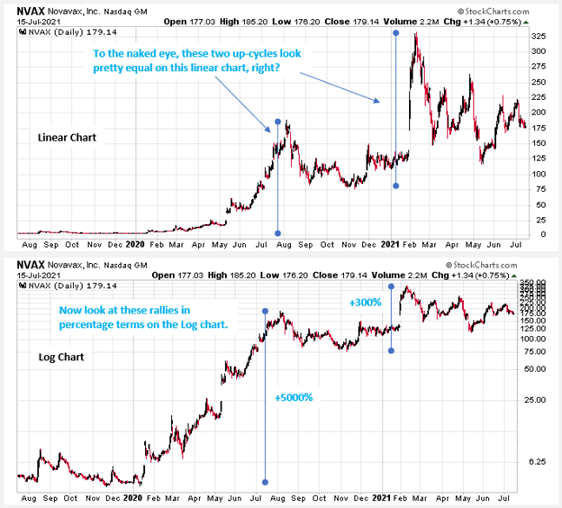
I’ve annotated the most glaring point of comparison, which is the period when NVAX surged nearly 5000% from its 2019 lows to its 2020 highs, on a combination of favorable Influenza and COVID-19 vaccine data.
I’ve also annotated the next big vaccine-related rally, when the stock rose 310% from its November 2020 low to its February 2021 high.
You’ll notice that on the linear chart, these rally cycles appear to be pretty equal.
However, it’s the logarithmic chart that tells the real truth, with the 2020 rally cleary dwarfing that of the 2020 to 2021 rally.
How to Switch from Linear to Logarithmic Scale
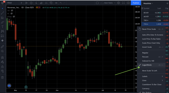
In popular charting applications like Tradingview and Stockcharts.com, you’ll take the following steps:
In Tradingview, simply right click in the right-hand margin of a chart and select Logarithmic, as shown on Figure 2 below.
Figure 2
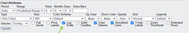
For Stockcharts.com, simply look below the chart and you’ll see a button that allows you to turn on Log Scale, as shown below.
Figure 3
In both cases, just remember to switch back to linear scaling for your usual shorter-term charting when you are done using the log charting.
Bottom Line
Both systems have their advantages and disadvantages.
Traders looking to capture short-term price movements or analyze trading ranges may prefer linear scales for price purity.
Chartists interested in trends and long-term price histories will likely prefer logarithmic charts.
Log scale is best used when prices have moved a significant amount, no matter the direction.


8 Comments
Thank you for the explination !!!!!!!!!!!!!!!!!!!!!!!!!!!!!!!!!!!!!!!!!!!!!!!!!!!!!!!!!!
Good article guys!
I love math.
Greetings! Very useful advice within this post! It
is the little changes that make the most significant changes.
Thanks for sharing!
Awesome
You are genius Jeff. Thanks
Outstanding…my first intro to this.It appears I’ve been missing a lot of visual info. Ty
I’m gone to tell my little brother, that he should also go to see this web site on regular basis to get updated from most
up-to-date reports.
Thanks for sharing your thoughts. I really appreciate your efforts and I will be waiting for your next write
ups thanks once again.